
| 일 | 월 | 화 | 수 | 목 | 금 | 토 |
|---|---|---|---|---|---|---|
| 1 | 2 | 3 | 4 | 5 | ||
| 6 | 7 | 8 | 9 | 10 | 11 | 12 |
| 13 | 14 | 15 | 16 | 17 | 18 | 19 |
| 20 | 21 | 22 | 23 | 24 | 25 | 26 |
| 27 | 28 | 29 | 30 |
- 서버 스크립트
- 오버라이딩
- bufferedInputStream
- 멱등성
- 컬렉션 프레임워크
- 참조타입
- 지연로딩
- 원시타입
- delete
- 즉시로딩
- select
- jsoup
- 오버로딩
- 프로그래머스 코테
- git 기초
- 피연산자
- 메세지 큐
- InterruptedException
- Shared Lock
- Java
- foreigen key
- SQL
- null/not null
- exclusive lock
- N+1
- 연산자와의 관계
- 추상메서드
- 변수와 메서드
- 프로그래머스
- 변수와 상수
- Today
- Total
[JAVA_Back-End]
[SPRING] BootStrap 본문
BootStrap
javascript framework 발전이 빠르게 진행
jquery ui => spa + (ajax/websocket)
=> ui
별도 개발
desktop
mobile
=> 크로스 브라우저(브라우저 버전별 / 종류별 호환성)
html / css / js 규정 = 권고사항
=> 같은 문법에도 조금 다른 디자인 출력
* 윈도우쪽에 이상 디자인 발생
=> 통합 개발
(해상도) 반응성(responsive)
=> css조정 (모바일 / 웹 다양한 사이즈 조정)
프로젝트 시 디자인을 고를 때 유용함
부트스트랩 => 스타트업 ( 모바일과 데스크탑 서비스를 같이 진행하기 위해 보통 이런식으로 진행)
큰 사이트(공공기관)는 해당 방식으로 모바일과 데스크탑을 엮으면 같이 에러가 발생하기 때문에 보통 분리 개발
ex) naver => https://www.naver.com, https://m.naver.com (웹 버전과 모바일 버전 분리 개발)
개발자가 부트스트랩 : 템플리트
Bootstrap
Powerful, extensible, and feature-packed frontend toolkit. Build and customize with Sass, utilize prebuilt grid system and components, and bring projects to life with powerful JavaScript plugins.
getbootstrap.com
Bootstrap
강력하고 확장 가능하며 기능이 풍부한 프론트엔드 툴킷. Sass로 빌드 및 커스터마이징하고, 사전 빌드된 그리드 시스템 및 구성 요소를 활용하고, 강력한 JavaScript 플러그인으로 프로젝트에 생기
getbootstrap.kr
한글 ver.
W3Schools Online Web Tutorials
W3Schools offers free online tutorials, references and exercises in all the major languages of the web. Covering popular subjects like HTML, CSS, JavaScript, Python, SQL, Java, and many, many more.
www.w3schools.com
w3schools에서도 bootstrap확인 가능
-> 부트스트랩 사용 시 사이트에서 돌아갈 수 있는 환경에 대해 명시해주어야 한다. (ex) xx.x버전 이상부터 지원 가능
* 부트스트랩 5 -> 모바일에서 깨지지 않도록 우선순위를 두었음

Bootstrap 5 Grid System
class를 통해 html/CSS을 작성할 수 있다.
margin -> 외부여백
padding -> 내부여백

Container
<!--container01.jsp-->
<%@ page language="java" contentType="text/html; charset=UTF-8"
    pageEncoding="UTF-8"%>
<!DOCTYPE html>
<html>
<head>
<meta charset="UTF-8">
<meta name="viewport" content="width=device-width, initial-scale=1">   <!-- 모바일 지원에 대한 내용 -->
<title>Insert title here</title>
<!-- css적용 -->
<link href="https://cdn.jsdelivr.net/npm/bootstrap@5.3.2/dist/css/bootstrap.min.css" rel="stylesheet" integrity="sha384-T3c6CoIi6uLrA9TneNEoa7RxnatzjcDSCmG1MXxSR1GAsXEV/Dwwykc2MPK8M2HN" crossorigin="anonymous">
<style type="text/css">
</style>
<script src="https://cdn.jsdelivr.net/npm/bootstrap@5.3.2/dist/js/bootstrap.bundle.min.js" integrity="sha384-C6RzsynM9kWDrMNeT87bh95OGNyZPhcTNXj1NW7RuBCsyN/o0jlpcV8Qyq46cDfL" crossorigin="anonymous"></script>
<script type="text/javascript">
</script>


</head>
<body>
<div class="container-fluid">   <!-- 화면 사이즈 별로 텍스트의 크기 조정 -->
<!-- <div class="container">   화면 사이즈별로 배치 자동 조정 -->
	<h1>Hello Bootstrap</h1>
	<p>some text</p>
	<p>some text</p>
	<p>some text</p>
</div>
</body>
</html>

<!--container02.jsp-->
<%@ page language="java" contentType="text/html; charset=UTF-8"
    pageEncoding="UTF-8"%>
<!DOCTYPE html>
<html>
<head>
<meta charset="UTF-8">
<meta name="viewport" content="width=device-width, initial-scale=1">   <!-- 모바일 지원에 대한 내용 -->
<title>Insert title here</title>
<!-- css적용 -->
<link href="https://cdn.jsdelivr.net/npm/bootstrap@5.3.2/dist/css/bootstrap.min.css" rel="stylesheet" integrity="sha384-T3c6CoIi6uLrA9TneNEoa7RxnatzjcDSCmG1MXxSR1GAsXEV/Dwwykc2MPK8M2HN" crossorigin="anonymous">
<style type="text/css">
	div {border: 1px solid black; }
</style>
<script src="https://cdn.jsdelivr.net/npm/bootstrap@5.3.2/dist/js/bootstrap.bundle.min.js" integrity="sha384-C6RzsynM9kWDrMNeT87bh95OGNyZPhcTNXj1NW7RuBCsyN/o0jlpcV8Qyq46cDfL" crossorigin="anonymous"></script>
<script type="text/javascript">
</script>


</head>
<body>
<div class="container-sm">container-sm</div>
<div class="container-md">container-sm</div>
<div class="container-lg">container-sm</div>
<div class="container-xl">container-sm</div>
<div class="container-xxl">container-sm</div>

</body>
</html>
<!--container03.jsp-->
<%@ page language="java" contentType="text/html; charset=UTF-8"
    pageEncoding="UTF-8"%>
<!DOCTYPE html>
<html>
<head>
<meta charset="UTF-8">
<meta name="viewport" content="width=device-width, initial-scale=1">   <!-- 모바일 지원에 대한 내용 -->
<title>Insert title here</title>
<!-- css적용 -->
<link href="https://cdn.jsdelivr.net/npm/bootstrap@5.3.2/dist/css/bootstrap.min.css" rel="stylesheet" integrity="sha384-T3c6CoIi6uLrA9TneNEoa7RxnatzjcDSCmG1MXxSR1GAsXEV/Dwwykc2MPK8M2HN" crossorigin="anonymous">
<style type="text/css">
</style>
<script src="https://cdn.jsdelivr.net/npm/bootstrap@5.3.2/dist/js/bootstrap.bundle.min.js" integrity="sha384-C6RzsynM9kWDrMNeT87bh95OGNyZPhcTNXj1NW7RuBCsyN/o0jlpcV8Qyq46cDfL" crossorigin="anonymous"></script>
<script type="text/javascript">
</script>


</head>
<body>

<div class="container">
	<h1>Hello Bootstrap</h1>
	<p>some text</p>
	<p>some text</p>
	<p>some text</p>
</div>


<!-- <div class="container pt-5">  전체 패딩 -->
<div class="container p-5 border bg-dark text-white">
	<h1>Hello Bootstrap</h1>
	<p>some text</p>
	<p>some text</p>
	<p>some text</p>
</div>
</body>
</html>
<!--gutter01.jsp-->
<%@ page language="java" contentType="text/html; charset=UTF-8"
    pageEncoding="UTF-8"%>
<!DOCTYPE html>
<html>
<head>
<meta charset="UTF-8">
<meta name="viewport" content="width=device-width, initial-scale=1">   <!-- 모바일 지원에 대한 내용 -->
<title>Insert title here</title>
<!-- css적용 -->
<link href="https://cdn.jsdelivr.net/npm/bootstrap@5.3.2/dist/css/bootstrap.min.css" rel="stylesheet" integrity="sha384-T3c6CoIi6uLrA9TneNEoa7RxnatzjcDSCmG1MXxSR1GAsXEV/Dwwykc2MPK8M2HN" crossorigin="anonymous">
<style type="text/css"></style>
<script src="https://cdn.jsdelivr.net/npm/bootstrap@5.3.2/dist/js/bootstrap.bundle.min.js" integrity="sha384-C6RzsynM9kWDrMNeT87bh95OGNyZPhcTNXj1NW7RuBCsyN/o0jlpcV8Qyq46cDfL" crossorigin="anonymous"></script>
<script type="text/javascript"></script>


</head>
<body>
<div class="container">
	<div class="row">
		<div class="col-3 border">
			Lorem ipsum dolor sit amet, consectetur adipisicing elit, sed do eiusmod tempor incididunt ut labore et dolore magna aliqua. Ut enim ad minim veniam, quis nostrud exercitation ullamco laboris nisi ut aliquip ex ea commodo consequat.
		</div>
		<div class="col-9 border">
			Lorem ipsum dolor sit amet, consectetur adipisicing elit, sed do eiusmod tempor incididunt ut labore et dolore magna aliqua. Ut enim ad minim veniam, quis nostrud exercitation ullamco laboris nisi ut aliquip ex ea commodo consequat.
		</div>
	</div>
</div>
</body>
</html>
Grid
<!--grid01.jsp-->
<%@ page language="java" contentType="text/html; charset=UTF-8"
    pageEncoding="UTF-8"%>
<!DOCTYPE html>
<html>
<head>
<meta charset="UTF-8">
<meta name="viewport" content="width=device-width, initial-scale=1">   <!-- 모바일 지원에 대한 내용 -->
<title>Insert title here</title>
<!-- css적용 -->
<link href="https://cdn.jsdelivr.net/npm/bootstrap@5.3.2/dist/css/bootstrap.min.css" rel="stylesheet" integrity="sha384-T3c6CoIi6uLrA9TneNEoa7RxnatzjcDSCmG1MXxSR1GAsXEV/Dwwykc2MPK8M2HN" crossorigin="anonymous">
<style type="text/css"></style>
<script src="https://cdn.jsdelivr.net/npm/bootstrap@5.3.2/dist/js/bootstrap.bundle.min.js" integrity="sha384-C6RzsynM9kWDrMNeT87bh95OGNyZPhcTNXj1NW7RuBCsyN/o0jlpcV8Qyq46cDfL" crossorigin="anonymous"></script>
<script type="text/javascript"></script>


</head>
<body>

<div class="container-fluid">
	<!-- 행 -->
	<div class="row">
		<!-- 열: 행에 대한 균등 분할 -->
		<div class="col-4" style="background-color:lavender;">col1</div>
		<div class="col-4" style="background-color:orange;">col2</div>
		<div class="col-4" style="background-color:lavender;">col3</div>
    </div>

    <div class="row">
		<!-- 열: 행에 대한 균등 분할 -->
		<div class="col-3" style="background-color:lavender;">col2</div>
		<div class="col-9" style="background-color:orange;">col3</div>
    </div>

    <div class="row">
		<!-- 열: 행에 대한 균등 분할 -->
		<div class="col-9" style="background-color:lavender;">col2</div>
		<div class="col-3" style="background-color:orange;">col3</div>
    </div>
</div>
</body>
</html>
<!--grid02.jsp-->
<%@ page language="java" contentType="text/html; charset=UTF-8"
    pageEncoding="UTF-8"%>
<!DOCTYPE html>
<html>
<head>
<meta charset="UTF-8">
<meta name="viewport" content="width=device-width, initial-scale=1">   <!-- 모바일 지원에 대한 내용 -->
<title>Insert title here</title>
<!-- css적용 -->
<link href="https://cdn.jsdelivr.net/npm/bootstrap@5.3.2/dist/css/bootstrap.min.css" rel="stylesheet" integrity="sha384-T3c6CoIi6uLrA9TneNEoa7RxnatzjcDSCmG1MXxSR1GAsXEV/Dwwykc2MPK8M2HN" crossorigin="anonymous">
<style type="text/css"></style>
<script src="https://cdn.jsdelivr.net/npm/bootstrap@5.3.2/dist/js/bootstrap.bundle.min.js" integrity="sha384-C6RzsynM9kWDrMNeT87bh95OGNyZPhcTNXj1NW7RuBCsyN/o0jlpcV8Qyq46cDfL" crossorigin="anonymous"></script>
<script type="text/javascript"></script>


</head>
<body>

<div class="container-fluid">
	<!-- 행 -->
	<div class="row">
		<!-- 열: 행에 대한 균등 분할 -->
		<div class="col-4" style="background-color:lavender;">col1</div>
		<div class="col-4" style="background-color:orange;">col2</div>
		<div class="col-4" style="background-color:lavender;">col3</div>
    </div>

    <div class="row">
		<!-- 열: 행에 대한 균등 분할 -->
		<div class="col-sm-4" style="background-color:lavender;">col1</div>
		<div class="col-sm-4" style="background-color:orange;">col2</div>
		<div class="col-sm-4" style="background-color:lavender;">col3</div>
    </div>

    <div class="row">
		<!-- 열: 행에 대한 균등 분할 -->
		<div class="col-sm-3" style="background-color:lavender;">col1</div>
		<div class="col-sm-9" style="background-color:orange;">col2</div>
    </div>

    <!-- 너무 작은 사이즈로 바뀌면 열이 행으로 변경된다. -->

</div>
</body>
</html>

<!--grid03.jsp-->
<%@ page language="java" contentType="text/html; charset=UTF-8"
    pageEncoding="UTF-8"%>
<!DOCTYPE html>
<html>
<head>
<meta charset="UTF-8">
<meta name="viewport" content="width=device-width, initial-scale=1">   <!-- 모바일 지원에 대한 내용 -->
<title>Insert title here</title>
<!-- css적용 -->
<link href="https://cdn.jsdelivr.net/npm/bootstrap@5.3.2/dist/css/bootstrap.min.css" rel="stylesheet" integrity="sha384-T3c6CoIi6uLrA9TneNEoa7RxnatzjcDSCmG1MXxSR1GAsXEV/Dwwykc2MPK8M2HN" crossorigin="anonymous">
<style type="text/css"></style>
<script src="https://cdn.jsdelivr.net/npm/bootstrap@5.3.2/dist/js/bootstrap.bundle.min.js" integrity="sha384-C6RzsynM9kWDrMNeT87bh95OGNyZPhcTNXj1NW7RuBCsyN/o0jlpcV8Qyq46cDfL" crossorigin="anonymous"></script>
<script type="text/javascript"></script>


</head>
<body>

<div class="container-fluid">

    <div class="row">
		<!-- 열: 행에 대한 균등 분할 -->
		<div class="col-sm-3 col-md-6" style="background-color:lavender;">col1</div>
		<div class="col-sm-9 col-md-6" style="background-color:orange;">col2</div>
    </div>

     <div class="row">
		<!-- 열: 행에 대한 균등 분할 -->
		<div class="col-sm-3 col-md-6 col-lg-4" style="background-color:lavender;">col1</div>
		<div class="col-sm-9 col-md-6 col-lg-8" style="background-color:orange;">col2</div>
    </div>


</div>
</body>
</html>
NestedColumns
<!--NestedColumns.jsp-->
<%@ page language="java" contentType="text/html; charset=UTF-8"
    pageEncoding="UTF-8"%>
<!DOCTYPE html>
<html>
<head>
<meta charset="UTF-8">
<meta name="viewport" content="width=device-width, initial-scale=1">   <!-- 모바일 지원에 대한 내용 -->
<title>Insert title here</title>
<!-- css적용 -->
<link href="https://cdn.jsdelivr.net/npm/bootstrap@5.3.2/dist/css/bootstrap.min.css" rel="stylesheet" integrity="sha384-T3c6CoIi6uLrA9TneNEoa7RxnatzjcDSCmG1MXxSR1GAsXEV/Dwwykc2MPK8M2HN" crossorigin="anonymous">
<style type="text/css"></style>
<script src="https://cdn.jsdelivr.net/npm/bootstrap@5.3.2/dist/js/bootstrap.bundle.min.js" integrity="sha384-C6RzsynM9kWDrMNeT87bh95OGNyZPhcTNXj1NW7RuBCsyN/o0jlpcV8Qyq46cDfL" crossorigin="anonymous"></script>
<script type="text/javascript"></script>


</head>
<body>
<div class="container-fluid mt-3">
	<h2>Nested Columns</h2>
	 <p>Add columns inside other columns:</p>
</div>

<div class="container-fluid">
  <div class="row">
    <div class="col-8 bg-warning p-4">
      .col-8
      <div class="row">
        <div class="col-6 bg-light p-2">.col-6</div>
        <div class="col-6 bg-secondary p-2">.col-6</div>
      </div>
    </div>
    <div class="col-4 bg-success p-4">.col-4</div>
  </div>
</div>
</body>
</html>

Typography
- class를 사용하여 글씨 크기 조정하기
<!-- Typography.jsp -->
<%@ page language="java" contentType="text/html; charset=UTF-8"
    pageEncoding="UTF-8"%>
<!DOCTYPE html>
<html>
<head>
<meta charset="UTF-8">
<meta name="viewport" content="width=device-width, initial-scale=1">   <!-- 모바일 지원에 대한 내용 -->
<title>Insert title here</title>
<!-- css적용 -->
<link href="https://cdn.jsdelivr.net/npm/bootstrap@5.3.2/dist/css/bootstrap.min.css" rel="stylesheet" integrity="sha384-T3c6CoIi6uLrA9TneNEoa7RxnatzjcDSCmG1MXxSR1GAsXEV/Dwwykc2MPK8M2HN" crossorigin="anonymous">
<style type="text/css"></style>
<script src="https://cdn.jsdelivr.net/npm/bootstrap@5.3.2/dist/js/bootstrap.bundle.min.js" integrity="sha384-C6RzsynM9kWDrMNeT87bh95OGNyZPhcTNXj1NW7RuBCsyN/o0jlpcV8Qyq46cDfL" crossorigin="anonymous"></script>
<script type="text/javascript"></script>


</head>
<body>
<div class="container mt-3">
	<p class="h1">h1 Bootstrap heading</p>
	<p class="h2">h2 Bootstrap heading</p>
	<p class="h3">h3 Bootstrap heading</p>
	<p class="h4">h4 Bootstrap heading</p>
	<p class="h5">h5 Bootstrap heading</p>
	<p class="h6">h6 Bootstrap heading</p>
</div>
</body>
</html>
Shadows
<!--shadows.jsp -->

<%@ page language="java" contentType="text/html; charset=UTF-8"
    pageEncoding="UTF-8"%>
<!DOCTYPE html>
<html>
<head>
<meta charset="UTF-8">
<meta name="viewport" content="width=device-width, initial-scale=1">   <!-- 모바일 지원에 대한 내용 -->
<title>Insert title here</title>
<!-- css적용 -->
<link href="https://cdn.jsdelivr.net/npm/bootstrap@5.3.2/dist/css/bootstrap.min.css" rel="stylesheet" integrity="sha384-T3c6CoIi6uLrA9TneNEoa7RxnatzjcDSCmG1MXxSR1GAsXEV/Dwwykc2MPK8M2HN" crossorigin="anonymous">
<style type="text/css"></style>
<script src="https://cdn.jsdelivr.net/npm/bootstrap@5.3.2/dist/js/bootstrap.bundle.min.js" integrity="sha384-C6RzsynM9kWDrMNeT87bh95OGNyZPhcTNXj1NW7RuBCsyN/o0jlpcV8Qyq46cDfL" crossorigin="anonymous"></script>
<script type="text/javascript"></script>


</head>
<body>
<div class="container mt-3">
  <h1>Shadows</h1>
  <p>Use the shadow- classes to to add shadows to an element:</p>
  <div class="shadow-none p-4 mb-4 bg-light">No shadow</div>
  <div class="shadow-sm p-4 mb-4 bg-white">Small shadow</div>
  <div class="shadow p-4 mb-4 bg-white">Default shadow</div>
  <div class="shadow-lg p-4 mb-4 bg-white">Large shadow</div>
</div>
</body>
</html>
Visibility
<!--visibility.jsp-->
<%@ page language="java" contentType="text/html; charset=UTF-8"
    pageEncoding="UTF-8"%>
<!DOCTYPE html>
<html>
<head>
<meta charset="UTF-8">
<meta name="viewport" content="width=device-width, initial-scale=1">   <!-- 모바일 지원에 대한 내용 -->
<title>Insert title here</title>
<!-- css적용 -->
<link href="https://cdn.jsdelivr.net/npm/bootstrap@5.3.2/dist/css/bootstrap.min.css" rel="stylesheet" integrity="sha384-T3c6CoIi6uLrA9TneNEoa7RxnatzjcDSCmG1MXxSR1GAsXEV/Dwwykc2MPK8M2HN" crossorigin="anonymous">
<style type="text/css"></style>
<script src="https://cdn.jsdelivr.net/npm/bootstrap@5.3.2/dist/js/bootstrap.bundle.min.js" integrity="sha384-C6RzsynM9kWDrMNeT87bh95OGNyZPhcTNXj1NW7RuBCsyN/o0jlpcV8Qyq46cDfL" crossorigin="anonymous"></script>
<script type="text/javascript"></script>


</head>
<body>
<div class="container mt-3">
	<h1>Visibility</h1>
	<p>Use the .visible or .invisible classes to control the visibility of elements. Note: These classes do not change the CSS display value. They only add visibility:visible or visibility:hidden to an element:</p>
	<div class="visible bg-success">보이냐?</div>
	<div class="invisible bg-warning">안보이지?</div>

</div>
</body>
</html>
Close
<!--close.jsp-->
<%@ page language="java" contentType="text/html; charset=UTF-8"
pageEncoding="UTF-8"%>
<!DOCTYPE html>
<html>
<head>
<meta charset="UTF-8">
<meta name="viewport" content="width=device-width, initial-scale=1"> <!-- 모바일 지원에 대한 내용 -->
<title>Insert title here</title>
<!-- css적용 -->
<link href="https://cdn.jsdelivr.net/npm/bootstrap@5.3.2/dist/css/bootstrap.min.css" rel="stylesheet" integrity="sha384-T3c6CoIi6uLrA9TneNEoa7RxnatzjcDSCmG1MXxSR1GAsXEV/Dwwykc2MPK8M2HN" crossorigin="anonymous">
<style type="text/css"></style>
<script src="https://cdn.jsdelivr.net/npm/bootstrap@5.3.2/dist/js/bootstrap.bundle.min.js" integrity="sha384-C6RzsynM9kWDrMNeT87bh95OGNyZPhcTNXj1NW7RuBCsyN/o0jlpcV8Qyq46cDfL" crossorigin="anonymous"></script>
<script type="text/javascript"></script>
</head>
<body>
<div class="container mt-3">
<h1>Close Icon</h1>
<p>Use the .close class to style a close icon. This is often used for alerts and modals. Note that we use the times; symbol to create the actual icon (a better looking "x"). Also note that it is right-aligned by default:</p>
<div class="clearfix">
<button type="button" class="close">×</button>
</div>
</div>
</body>
</html>
Table
<!--table.jsp-->
<%@ page language="java" contentType="text/html; charset=UTF-8"
    pageEncoding="UTF-8"%>
<!DOCTYPE html>
<html>
<head>
<meta charset="UTF-8">
<meta name="viewport" content="width=device-width, initial-scale=1">
<!-- 모바일 지원에 대한 내용 -->
<title>Insert title here</title>
<!-- css적용 -->
<link
	href="https://cdn.jsdelivr.net/npm/bootstrap@5.3.2/dist/css/bootstrap.min.css"
	rel="stylesheet"
	integrity="sha384-T3c6CoIi6uLrA9TneNEoa7RxnatzjcDSCmG1MXxSR1GAsXEV/Dwwykc2MPK8M2HN"
	crossorigin="anonymous">
<style type="text/css"></style>
<script
	src="https://cdn.jsdelivr.net/npm/bootstrap@5.3.2/dist/js/bootstrap.bundle.min.js"
	integrity="sha384-C6RzsynM9kWDrMNeT87bh95OGNyZPhcTNXj1NW7RuBCsyN/o0jlpcV8Qyq46cDfL"
	crossorigin="anonymous"></script>
<script type="text/javascript"></script>


</head>
<body>
	<div class="container">
		<table class="table table-dark table-striped table-hover"> <!-- 쉽게 디자인 할 수 있도록 안에 클래스를 내장 -->
			<thead>
				<tr>
					<th>Firstname</th>
					<th>Lastname</th>
					<th>Email</th>
				</tr>
			</thead>
			<tbody>
				<tr>
					<td>John</td>
					<td>Doe</td>
					<td>john@example.com</td>
				</tr>
				<tr>
					<td>Mary</td>
					<td>Moe</td>
					<td>mary@example.com</td>
				</tr>
				<tr>
					<td>July</td>
					<td>Dooley</td>
					<td>july@example.com</td>
				</tr>
			</tbody>
		</table>
	</div>
</body>
</html>
<!--table02.jsp-->
<%@ page language="java" contentType="text/html; charset=UTF-8"
    pageEncoding="UTF-8"%>
<!DOCTYPE html>
<html>
<head>
<meta charset="UTF-8">
<meta name="viewport" content="width=device-width, initial-scale=1">
<!-- 모바일 지원에 대한 내용 -->
<title>Insert title here</title>
<!-- css적용 -->
<link
	href="https://cdn.jsdelivr.net/npm/bootstrap@5.3.2/dist/css/bootstrap.min.css"
	rel="stylesheet"
	integrity="sha384-T3c6CoIi6uLrA9TneNEoa7RxnatzjcDSCmG1MXxSR1GAsXEV/Dwwykc2MPK8M2HN"
	crossorigin="anonymous">
<style type="text/css"></style>
<script
	src="https://cdn.jsdelivr.net/npm/bootstrap@5.3.2/dist/js/bootstrap.bundle.min.js"
	integrity="sha384-C6RzsynM9kWDrMNeT87bh95OGNyZPhcTNXj1NW7RuBCsyN/o0jlpcV8Qyq46cDfL"
	crossorigin="anonymous"></script>
<script type="text/javascript"></script>


</head>
<body>
<div class="container">
	<div class="table-responsive-sm">
		<div>
			<table class="table table-bordered">

				<thead>
					<tr>
						<th>#</th>
						<th>Firstname</th>
						<th>Lastname</th>
						<th>Age</th>
						<th>City</th>
						<th>Country</th>
						<th>Sex</th>
						<th>Example</th>
						<th>Example</th>
						<th>Example</th>
						<th>Example</th>
						<th>Example</th>
						<th>Example</th>
						<th>Example</th>
						<th>Example</th>
						<th>Example</th>
						<th>Example</th>
						<th>Example</th>
						<th>Example</th>
					</tr>
				</thead>
				<tbody>
					<tr>
						<td>1</td>
						<td>Anna</td>
						<td>Pitt</td>
						<td>35</td>
						<td>New York</td>
						<td>USA</td>
						<td>Female</td>
						<td>Yes</td>
						<td>Yes</td>
						<td>Yes</td>
						<td>Yes</td>
						<td>Yes</td>
						<td>Yes</td>
						<td>Yes</td>
						<td>Yes</td>
						<td>Yes</td>
						<td>Yes</td>
						<td>Yes</td>
						<td>Yes</td>
					</tr>
				</tbody>
			</table>
		</div>
	</div>
</div>
</body>
</html>
Border
border 이름
왼쪽 start
위쪽 top
오른쪽 end
아래쪽 bottom
<!--border.jsp-->
<%@ page language="java" contentType="text/html; charset=UTF-8"
    pageEncoding="UTF-8"%>
<!DOCTYPE html>
<html>
<head>
<meta charset="UTF-8">
<meta name="viewport" content="width=device-width, initial-scale=1">   <!-- 모바일 지원에 대한 내용 -->
<title>Insert title here</title>
<!-- css적용 -->
<link href="https://cdn.jsdelivr.net/npm/bootstrap@5.3.2/dist/css/bootstrap.min.css" rel="stylesheet" integrity="sha384-T3c6CoIi6uLrA9TneNEoa7RxnatzjcDSCmG1MXxSR1GAsXEV/Dwwykc2MPK8M2HN" crossorigin="anonymous">
<style type="text/css">

span{
	display:inline-block;
	width:70px;
	height:70px;
	margin:6px;
	background-color:#f9f9f9;
}

</style>
<script src="https://cdn.jsdelivr.net/npm/bootstrap@5.3.2/dist/js/bootstrap.bundle.min.js" integrity="sha384-C6RzsynM9kWDrMNeT87bh95OGNyZPhcTNXj1NW7RuBCsyN/o0jlpcV8Qyq46cDfL" crossorigin="anonymous"></script>
<script type="text/javascript"></script>


</head>
<body>
<div class="container mt-3">
	<h2>Borders</h2>
	<p>Use the border classes to add or remove borders from an element:</p>

	<span class="border"></span>
	<span class="border border-0"></span>
	<span class="border border-top-0"></span>
	<span class="border border-end-0"></span>
	<span class="border border-bottom-0"></span>
	<span class="border border-start-0"></span>
	<br />

	<span class="border-top"></span>
	<span class="border-end"></span>
	<span class="border-bottom"></span>
	<span class="border-start"></span>
</div>
</body>
</html>
<!--border02.jsp-->
<%@ page language="java" contentType="text/html; charset=UTF-8"
    pageEncoding="UTF-8"%>
<!DOCTYPE html>
<html>
<head>
<meta charset="UTF-8">
<meta name="viewport" content="width=device-width, initial-scale=1">   <!-- 모바일 지원에 대한 내용 -->
<title>Insert title here</title>
<!-- css적용 -->
<link href="https://cdn.jsdelivr.net/npm/bootstrap@5.3.2/dist/css/bootstrap.min.css" rel="stylesheet" integrity="sha384-T3c6CoIi6uLrA9TneNEoa7RxnatzjcDSCmG1MXxSR1GAsXEV/Dwwykc2MPK8M2HN" crossorigin="anonymous">
<style type="text/css">
span{
	display:inline-block;
	width:70px;
	height:70px;
	margin:6px;
	background-color:#555;
}
</style>
<script src="https://cdn.jsdelivr.net/npm/bootstrap@5.3.2/dist/js/bootstrap.bundle.min.js" integrity="sha384-C6RzsynM9kWDrMNeT87bh95OGNyZPhcTNXj1NW7RuBCsyN/o0jlpcV8Qyq46cDfL" crossorigin="anonymous"></script>
<script type="text/javascript"></script>


</head>
<body>
<div class="container mt-3">
  <h2>Borders</h2>
  <p>Round the corner of an element with the rounded classes:</p>
  <span class="rounded"></span>
  <span class="rounded-top"></span>
  <span class="rounded-end"></span>
  <span class="rounded-bottom"></span>
  <span class="rounded-start"></span>
  <span class="rounded-circle"></span>
  <span class="rounded-pill" style="width:130px"></span>
  <br>
  <span class="rounded-0"></span>
  <span class="rounded-1"></span>
  <span class="rounded-2"></span>
  <span class="rounded-3"></span>
  <span class="rounded-4"></span>
  <span class="rounded-5"></span>
</div>
</body>
</html>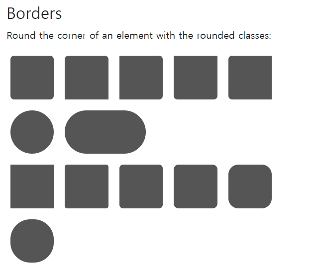
Image
<!--image01.jsp-->
<%@ page language="java" contentType="text/html; charset=UTF-8"
    pageEncoding="UTF-8"%>
<!DOCTYPE html>
<html>
<head>
<meta charset="UTF-8">
<meta name="viewport" content="width=device-width, initial-scale=1">   <!-- 모바일 지원에 대한 내용 -->
<title>Insert title here</title>
<!-- css적용 -->
<link href="https://cdn.jsdelivr.net/npm/bootstrap@5.3.2/dist/css/bootstrap.min.css" rel="stylesheet" integrity="sha384-T3c6CoIi6uLrA9TneNEoa7RxnatzjcDSCmG1MXxSR1GAsXEV/Dwwykc2MPK8M2HN" crossorigin="anonymous">
<style type="text/css"></style>
<script src="https://cdn.jsdelivr.net/npm/bootstrap@5.3.2/dist/js/bootstrap.bundle.min.js" integrity="sha384-C6RzsynM9kWDrMNeT87bh95OGNyZPhcTNXj1NW7RuBCsyN/o0jlpcV8Qyq46cDfL" crossorigin="anonymous"></script>
<script type="text/javascript"></script>


</head>
<body>

<div class="container mt-5">
<img src="https://www.w3schools.com/bootstrap5/paris.jpg" width="250"/>
<img class="rounded" src="https://www.w3schools.com/bootstrap5/paris.jpg" width="250"/>
<img class="rounded-circle" src="https://www.w3schools.com/bootstrap5/paris.jpg" width="250"/>
<img class="img-thumbnail" src="https://www.w3schools.com/bootstrap5/paris.jpg" width="250"/>

</div>
</body>
</html>
<!--image02.jsp-->
<%@ page language="java" contentType="text/html; charset=UTF-8"
    pageEncoding="UTF-8"%>
<!DOCTYPE html>
<html>
<head>
<meta charset="UTF-8">
<meta name="viewport" content="width=device-width, initial-scale=1">   <!-- 모바일 지원에 대한 내용 -->
<title>Insert title here</title>
<!-- css적용 -->
<link href="https://cdn.jsdelivr.net/npm/bootstrap@5.3.2/dist/css/bootstrap.min.css" rel="stylesheet" integrity="sha384-T3c6CoIi6uLrA9TneNEoa7RxnatzjcDSCmG1MXxSR1GAsXEV/Dwwykc2MPK8M2HN" crossorigin="anonymous">
<style type="text/css"></style>
<script src="https://cdn.jsdelivr.net/npm/bootstrap@5.3.2/dist/js/bootstrap.bundle.min.js" integrity="sha384-C6RzsynM9kWDrMNeT87bh95OGNyZPhcTNXj1NW7RuBCsyN/o0jlpcV8Qyq46cDfL" crossorigin="anonymous"></script>
<script type="text/javascript"></script>


</head>
<body>

<div class="container mt-5">
<img class="img-fluid" src="https://www.w3schools.com/bootstrap5/ny.jpg" width="1100"/>
</div>
</body>
</html>
<!--jumbotron.jsp-->
<%@ page language="java" contentType="text/html; charset=UTF-8"
    pageEncoding="UTF-8"%>
<!DOCTYPE html>
<html>
<head>
<meta charset="UTF-8">
<meta name="viewport" content="width=device-width, initial-scale=1">   <!-- 모바일 지원에 대한 내용 -->
<title>Insert title here</title>
<!-- css적용 -->
<link href="https://cdn.jsdelivr.net/npm/bootstrap@5.3.2/dist/css/bootstrap.min.css" rel="stylesheet" integrity="sha384-T3c6CoIi6uLrA9TneNEoa7RxnatzjcDSCmG1MXxSR1GAsXEV/Dwwykc2MPK8M2HN" crossorigin="anonymous">
<style type="text/css"></style>
<script src="https://cdn.jsdelivr.net/npm/bootstrap@5.3.2/dist/js/bootstrap.bundle.min.js" integrity="sha384-C6RzsynM9kWDrMNeT87bh95OGNyZPhcTNXj1NW7RuBCsyN/o0jlpcV8Qyq46cDfL" crossorigin="anonymous"></script>
<script type="text/javascript"></script>


</head>
<body>
<div class="container mt-3">    <!-- 영역에 크게 보여줄 때 사용 -->
 	<div class="mt-4 rounded bg-primary text-white">
 		<h1>Header</h1>
 		<p>content</p>
 	</div>
</div>
</body>
</html>
Collapse
<!--collapse-->
<%@ page language="java" contentType="text/html; charset=UTF-8"
    pageEncoding="UTF-8"%>
<!DOCTYPE html>
<html>
<head>
<meta charset="UTF-8">
<meta name="viewport" content="width=device-width, initial-scale=1">   <!-- 모바일 지원에 대한 내용 -->
<title>Insert title here</title>
<!-- css적용 -->
<link href="https://cdn.jsdelivr.net/npm/bootstrap@5.3.2/dist/css/bootstrap.min.css" rel="stylesheet" integrity="sha384-T3c6CoIi6uLrA9TneNEoa7RxnatzjcDSCmG1MXxSR1GAsXEV/Dwwykc2MPK8M2HN" crossorigin="anonymous">
<style type="text/css"></style>
<script src="https://cdn.jsdelivr.net/npm/bootstrap@5.3.2/dist/js/bootstrap.bundle.min.js" integrity="sha384-C6RzsynM9kWDrMNeT87bh95OGNyZPhcTNXj1NW7RuBCsyN/o0jlpcV8Qyq46cDfL" crossorigin="anonymous"></script>
<script type="text/javascript"></script>


</head>
<body>
<div class="container">
	<button class="btn btn-primary" data-bs-toggle="collapse" data-bs-target="#demo">Collapsible</button>
	<div id="demo" class="collapse">
	내용<br />
	내용<br />
	내용<br />
	내용<br />
	내용<br />
	내용<br />
	내용<br />
	</div>

</div>
</body>
</html>

Accordion - 구구단 출력
<!--Accordion -->
<%@ page language="java" contentType="text/html; charset=UTF-8"
    pageEncoding="UTF-8"%>
<!DOCTYPE html>
<html>
<head>
<meta charset="UTF-8">
<meta name="viewport" content="width=device-width, initial-scale=1"/>
<link href="https://cdn.jsdelivr.net/npm/bootstrap@5.3.2/dist/css/bootstrap.min.css" rel="stylesheet" integrity="sha384-T3c6CoIi6uLrA9TneNEoa7RxnatzjcDSCmG1MXxSR1GAsXEV/Dwwykc2MPK8M2HN" crossorigin="anonymous">
<style type="text/css">
</style>
<script src="https://cdn.jsdelivr.net/npm/bootstrap@5.3.2/dist/js/bootstrap.bundle.min.js"></script>
<script src="https://code.jquery.com/jquery-3.6.0.min.js"></script> <!-- jQuery 추가 -->

<script>
    $(document).ready(function() {
        $('#btn').on('click', function() {
            var output = "";

            for (var i = 1; i <= 4; i++) {
                output += '<div class="card">';
                output += '<div class="card-header">';
                output += '<a class="btn" data-bs-toggle="collapse" href="#collapse' + i + '">';
                output += '구구단 ' + i + '단';
                output += '</a>';
                output += '</div>';
                output += '<div id="collapse' + i + '" class="collapse" data-bs-parent="#accordion">';
                output += '<div class="card-body">';
                for (var j = 1; j <= 9; j++) {
                    output += i + ' x ' + j + ' = ' + (i * j) + '<br>';
                }
                output += '</div>';
                output += '</div>';
                output += '</div>';
            }

            $('#accordion').html(output);
        });
        $('#btn1').on('click', function() {
           var output ="";

            $('#accordion').html(output);
        });
    });
</script>
<title>Insert title here</title>
</head>
<body>
<div class="container p-3">
    <button id="btn" class="btn btn-primary">구구단 출력 (1 ~ 4단)</button>
    <button id="btn1" class="btn btn-primary">구구단 지우기</button>
    <div id="accordion"></div>
</div>
</body>
</html>
Alert
<!--Alert-->
<%@ page language="java" contentType="text/html; charset=UTF-8"
    pageEncoding="UTF-8"%>
<!DOCTYPE html>
<html>
<head>
<meta charset="UTF-8">
<meta name="viewport" content="width=device-width, initial-scale=1">   <!-- 모바일 지원에 대한 내용 -->
<title>Insert title here</title>
<!-- css적용 -->
<link href="https://cdn.jsdelivr.net/npm/bootstrap@5.3.2/dist/css/bootstrap.min.css" rel="stylesheet" integrity="sha384-T3c6CoIi6uLrA9TneNEoa7RxnatzjcDSCmG1MXxSR1GAsXEV/Dwwykc2MPK8M2HN" crossorigin="anonymous">
<style type="text/css"></style>
<script src="https://cdn.jsdelivr.net/npm/bootstrap@5.3.2/dist/js/bootstrap.bundle.min.js" integrity="sha384-C6RzsynM9kWDrMNeT87bh95OGNyZPhcTNXj1NW7RuBCsyN/o0jlpcV8Qyq46cDfL" crossorigin="anonymous"></script>
<script type="text/javascript"></script>


</head>
<body>
<div class="container mt-3">
	<div class="alert alert-danger">
		<strong>성공</strong>Hello alert
	</div>

	<div class="alert alert-danger alert-dismissible">
		<button class="btn-close" data-bs-dismiss="alert"></button>
		<strong>성공</strong>Hello alert <a href="#" class="alert-link">바로 가기</a>
	</div>
</div>
</body>
</html>
Badge
<!--Badge-->
<%@ page language="java" contentType="text/html; charset=UTF-8"
    pageEncoding="UTF-8"%>
<!DOCTYPE html>
<html>
<head>
<meta charset="UTF-8">
<meta name="viewport" content="width=device-width, initial-scale=1">   <!-- 모바일 지원에 대한 내용 -->
<title>Insert title here</title>
<!-- css적용 -->
<link href="https://cdn.jsdelivr.net/npm/bootstrap@5.3.2/dist/css/bootstrap.min.css" rel="stylesheet" integrity="sha384-T3c6CoIi6uLrA9TneNEoa7RxnatzjcDSCmG1MXxSR1GAsXEV/Dwwykc2MPK8M2HN" crossorigin="anonymous">
<style type="text/css"></style>

<script src="https://cdn.jsdelivr.net/npm/bootstrap@5.3.2/dist/js/bootstrap.bundle.min.js" integrity="sha384-C6RzsynM9kWDrMNeT87bh95OGNyZPhcTNXj1NW7RuBCsyN/o0jlpcV8Qyq46cDfL" crossorigin="anonymous"></script>

<script type="text/javascript" src="https://cdn.jsdelivr.net/npm/jquery@3.7.1/dist/jquery.min.js"></script>
<script type="text/javascript">
	$(document).ready(function(){
		$('#plus').on('click',function(){
			$('#spn').text('5');
		});

		$('#minus').on('click',function(){
			$('#spn').text('4');
		});
	});
</script>
</head>


<body>
<div class="container">
	<button class="btn btn-primary">
	Message<span id="spn" class="badge bg-danger">4</span>
	</button>
	<br /><br />
	<div>
	<button id="minus" class="btn btn-secondary float-start">감소</button>
	<button id="plus" class="btn btn-secondary float-end">증가</button>
	</div>
</div>
</body>
</html>
Breadcrumbs
<!--Breadcrumbs-->
<%@ page language="java" contentType="text/html; charset=UTF-8"
    pageEncoding="UTF-8"%>
<!DOCTYPE html>
<html>
<head>
<meta charset="UTF-8">
<meta name="viewport" content="width=device-width, initial-scale=1">   <!-- 모바일 지원에 대한 내용 -->
<title>Insert title here</title>
<!-- css적용 -->
<link href="https://cdn.jsdelivr.net/npm/bootstrap@5.3.2/dist/css/bootstrap.min.css" rel="stylesheet" integrity="sha384-T3c6CoIi6uLrA9TneNEoa7RxnatzjcDSCmG1MXxSR1GAsXEV/Dwwykc2MPK8M2HN" crossorigin="anonymous">
<style type="text/css"></style>
<script src="https://cdn.jsdelivr.net/npm/bootstrap@5.3.2/dist/js/bootstrap.bundle.min.js" integrity="sha384-C6RzsynM9kWDrMNeT87bh95OGNyZPhcTNXj1NW7RuBCsyN/o0jlpcV8Qyq46cDfL" crossorigin="anonymous"></script>
<script type="text/javascript"></script>


</head>
<body>
<div class="container mt-3">
  <h2>Breadcrumbs</h2>
  <p>The .breadcrumb class indicates the current page's location within a navigational hierarchy:</p>
  <ul class="breadcrumb">
    <li class="breadcrumb-item"><a href="#">Photos</a></li>
    <li class="breadcrumb-item"><a href="#">Summer 2017</a></li>
    <li class="breadcrumb-item"><a href="#">Italy</a></li>
    <li class="breadcrumb-item active">Rome</li>
  </ul>
</div>
</body>
</html>
Button Group
<!--button_group-->
<%@ page language="java" contentType="text/html; charset=UTF-8"
    pageEncoding="UTF-8"%>
<!DOCTYPE html>
<html>
<head>
<meta charset="UTF-8">
<meta name="viewport" content="width=device-width, initial-scale=1">
<!-- 모바일 지원에 대한 내용 -->
<title>Insert title here</title>
<!-- css적용 -->
<link
	href="https://cdn.jsdelivr.net/npm/bootstrap@5.3.2/dist/css/bootstrap.min.css"
	rel="stylesheet"
	integrity="sha384-T3c6CoIi6uLrA9TneNEoa7RxnatzjcDSCmG1MXxSR1GAsXEV/Dwwykc2MPK8M2HN"
	crossorigin="anonymous">
<style type="text/css"></style>
<script
	src="https://cdn.jsdelivr.net/npm/bootstrap@5.3.2/dist/js/bootstrap.bundle.min.js"
	integrity="sha384-C6RzsynM9kWDrMNeT87bh95OGNyZPhcTNXj1NW7RuBCsyN/o0jlpcV8Qyq46cDfL"
	crossorigin="anonymous"></script>
<script type="text/javascript"></script>


</head>
<body>
	<div class="container mt-3">
		<h2>Vertical Button Group</h2>
		<p>Use the .btn-group-vertical class to create a vertical button
			group:</p>
		<div class="btn-group-vertical">
			<button type="button" class="btn btn-primary">Apple</button>
			<button type="button" class="btn btn-primary">Samsung</button>
			<button type="button" class="btn btn-primary">Sony</button>
		</div>
	</div>

	<div class="container mt-3">
		<h2>Button Group</h2>
		<p>Button groups are "inline" by default, which makes them appear
			side by side when you have multiple groups:</p>
		<div class="btn-group">
			<button type="button" class="btn btn-primary">Apple</button>
			<button type="button" class="btn btn-primary">Samsung</button>
			<button type="button" class="btn btn-primary">Sony</button>
		</div>
		<div class="btn-group">
			<button type="button" class="btn btn-primary">BMW</button>
			<button type="button" class="btn btn-primary">Mercedes</button>
			<button type="button" class="btn btn-primary">Volvo</button>
		</div>
	</div>
</body>
</html>
Window
- Linux 설치 / 사용법
- 노트북 - 여유공간 / 램 ...
vmware workstation player
'Programming > SPRING' 카테고리의 다른 글
| [SPRING] Spring Boot (Zipcode 수동 dependency) (0) | 2023.11.21 |
|---|---|
| [SPRING] AOP(Aspect Oriented Programming) (0) | 2023.11.16 |
| [SPRING] Spring의 기본 개념과 사용 (0) | 2023.11.14 |
| [SPRING] Mapper (0) | 2023.10.25 |
| [SPRING] lombok + mybatis (0) | 2023.10.24 |


